Introduction
ICL's web presence grew one site at a time: the lab site, a template shared by project sites, and the newsletter. Each is close in spirit but different in execution. This system extracts what already works — Tennessee Orange over dark structural bands (re-grounded on UT's warm Limestone), the Adobe Fonts pairing, the per-project color idea — and rebuilds it as a token-driven foundation everything can share.
Tier 1 · Primitives
Raw values
Color scales, type sizes, the 4px space scale. Defined once in tokens/tokens.css and tokens/tokens.json. Never referenced directly by components.
Tier 2 · Semantic
Roles, not colors
Components consume roles like --icl-color-accent and --icl-color-text-muted. Because meaning is separated from value, retheming is a five-token swap.
Tier 3 · Components
Built parts
css/icl.css ships buttons, cards, tables, publication lists, navigation, and page bands — the vocabulary of every ICL page.
Principles
1 · Content is the interface
ICL pages exist to deliver software, papers, and people. Layouts stay quiet: generous whitespace, high contrast, restrained decoration. Nothing competes with a download link or a citation.
2 · One lab, many projects
Every property is unmistakably ICL — Limestone, Smokey, Rift headlines — while each project owns a single accent color. Family resemblance first, individuality second.
3 · Engineered, not decorated
The aesthetic borrows from the lab's work: grid textures like graph paper, hairline keylines, tabular data set with care, mono type for versions and code. Precision is the ornament.
4 · Accessible by default
Text colors meet WCAG AA out of the box. Tennessee Orange is an accent, never body text — the same rule UT's own brand guide applies. Focus states are visible everywhere.
Color
Three families do the structural work: Tennessee Orange ties ICL to the university, Limestone is the structural neutral — warm light surfaces through the dark stone bands — and Smokey grays handle text. Globe blue is reserved for links. Per UT brand standards, pure black is never used. (The legacy site's cool Slate family was retired in v0.3 in Limestone's favor.)
Tennessee Orange · accent only
★ PMS 151, the official UT primary. Steps 700+ pass AA as text on white.
Limestone · the structural neutral — surfaces & dark bands
★ UT "Limestone" (CMYK 5 5 10 0), extended to a full ramp. 75 is the big-surface tint (100 reads strong across a whole band), 200 the default border, 900 the dark stone bands, 950 the ink for headings-on-accent and hovers. Adopted in v0.3, replacing the legacy site's cool Slate family.
Smokey · text and neutral surfaces
★ UT "Smokey" gray. Body text is gray-800; muted text gray-600.
Globe · links only
★ UT secondary "Globe." Links are Globe 600 on every property and theme — historically, links are blue. 5.9:1 on white; Globe 300 is the link color on the dark bands. Globe is reserved for links; eyebrows use the accent hue (see the note below).
Semantic roles
Components never reference the scales above — they use roles. Themes override only the accent group.
--icl-color-accent--icl-color-accent-strong--icl-color-accent-soft--icl-color-link--icl-color-eyebrow--icl-color-text--icl-color-text-muted--icl-color-heading--icl-color-inverse-bg--icl-color-border--icl-color-surface-sunkenTypography
Four voices, all licensed on ICL's consolidated Adobe Fonts kit. Rift gives ICL its distinct engineered headline voice — and, because buttons are actions, the button voice; Proxima Nova does the everyday work; Merriweather handles long-form reading; mono handles code.
Headlines in Rift are always uppercase. Never letterspace lowercase Rift; never use Rift below 1rem except in table headers and small buttons. Badges are Proxima Nova — in Rift they would read as buttons.
Scale & roles
Display
Heading 1 · 2.44rem fluid
Heading 2 · 1.95rem
Heading 3 · 1.56rem
Heading 4 · 1.25rem
Lede paragraph — 1.25rem, muted, for section introductions. .icl-lede
Body — 1rem / 1.6. Links look like this link — Globe blue (--icl-color-link), constant across every theme, because historically links on the web are blue.
Signature name style — Jack Dongarra: first name Merriweather bold, last name Proxima Nova caps. .icl-name__first / .icl-name__last
Small / meta — 0.875rem muted, for captions, dates, and attribution.
Spacing & layout
A 4px base scale, a 1152px content container, and pages built as full-width alternating bands — white, sunken limestone, and dark stone.
--icl-space-1 · 4px--icl-space-2 · 8px--icl-space-3 · 12px--icl-space-4 · 16px--icl-space-5 · 24px--icl-space-6 · 32px--icl-space-7 · 48px--icl-space-8 · 64px--icl-space-9 · 96pxSignature motifs
Three details make a page read as ICL — this very band demonstrates two of them.
The keyline
A 3px accent rule on the top edge of navs, cards, footers, and code blocks — inherited from the orange rules on today's icl.utk.edu. It's where the project theme shows up most often. .icl-keyline-top
The signature background effect
One adaptive effect, descended from the legacy grid-bg.jpg but built in pure CSS + SVG: soft, slightly grubby printed lines with a film-grain wash. It reads the band it's on — horizontal scanlines on light limestone (warm ink, multiply-blended) and the crossed graph-paper grid, light-on-dark, on stone bands. Either way it fades in relation to the heading: clean where the heading sits (upper left by default), emerging toward the opposite corner. Add .icl-background-fx--center on centered bands, or .icl-background-fx--spotlight to invert the veil — fullest at a focal point (--icl-fx-focus), fading away to nothing within an ellipse sized by --icl-fx-spotlight (default reach dies out by the top/bottom of a collage's photos), as behind the collage feature's images. .icl-background-fx
Stone bands
Dark limestone-900 sections anchor every page — hero at the top, footer at the bottom. Orange (or the project accent) appears against the warm stone as its accent-inverse step.
One class, two treatments
.icl-background-fx is context-aware: on a light surface it lays down scanlines, on a dark stone band it draws the grid. You don't pick — the band does. (Force the dark treatment on an otherwise-light element with .icl-background-fx--inverse.)
Scanlines on limestone
Grid on stone
Components
Every part below is built from semantic tokens only, so all of it rethemes automatically. The swatches shown use the default ICL orange theme — visit Project themes to see them change.
Buttons
Badges & tags
Forms
Enter a valid email address.
Alerts
MAGMA 2.9.0 released
Adds support for CUDA 13 and unified memory batched routines.
Subscription confirmed
You'll receive release announcements at most monthly.
Beta interface
The counter API may change before the stable release.
End of life
PLASMA 2.x is no longer maintained — migrate to the 17+ series.
Cards
Software
MAGMA
Dense linear algebra for heterogeneous GPU-accelerated architectures.
Software
PAPI
A portable interface to hardware performance counters across CPUs, GPUs, and I/O.
News · June 2026
ICL at ISC High Performance
Lab members presented five papers and two tutorials in Hamburg.
People
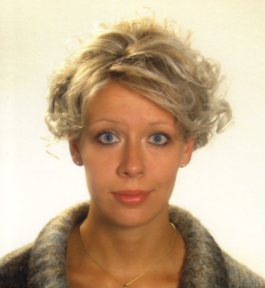
Heike Jagode
Interim Director of ICL

Jack Dongarra
Research Professor Emeritus

Piotr Luszczek
Research Associate Professor
Ahmad Abdelfattah
Research Assistant Professor
The signature name style — first name Merriweather bold, last name Proxima Nova caps — comes from the PAPI team grid and works anywhere names appear (team grids, bylines, directory listings). Wrap photos in .icl-person__photo-frame for the duotone treatment — a CSS gradient map that renders the photo as accent ink on warm white and returns it to full color on hover (demo photos load live from icl.utk.edu). Tune per use via --icl-duotone-ink-mix, --icl-duotone-contrast, and --icl-duotone-paper. When no photo is available, use the initials block (.icl-person__photo.icl-person__initials) as the fallback, shown last.
Stats
Tabs
The overview panel — mirrors the section nav on today's project sites (Overview · Downloads · Papers · Team).
Download links and release tarballs live here.
Citations with DOI and BibTeX actions.
People grid, filtered to project contributors.
Tables
Publication list
-
Accelerating Mixed-Precision Iterative Refinement on Exascale GPUs
Proceedings of SC '25, Atlanta, GA, November 2025
-
PAPI 7: Counter Analysis for Heterogeneous Memory Systems
Concurrency and Computation: Practice and Experience, 2026
Code
Inline code like --icl-color-accent, and blocks:
git clone https://bitbucket.org/icl/magma.git
cd magma && mkdir build && cd build
cmake -DMAGMA_ENABLE_CUDA=ON ..
make -j
Navigation & footer
The sticky navbar at the top of this page and the footer below are the live components: limestone-900 stone surfaces with the accent keyline. On project sites the brand slot reads ICL | Project Name — see the project template.
The active link carries a keyline-colored underline that lands exactly on the navbar's bottom keyline. Add data-scrollspy to the .icl-navbar__nav and that highlight follows the page as you scroll — js/icl.js moves aria-current="page" to the link whose in-page section is under the navbar. It's opt-in, so multi-page sites that set the current page server-side are left alone. Anchor jumps clear the sticky navbar via scroll-padding-top.
Project themes
Each ICL project keeps the whole foundation and overrides exactly five accent tokens. Tennessee Orange stays reserved for the lab itself. Try it — everything inside the frame below rethemes from one attribute.
Choosing a new project color
- Stay off Tennessee Orange. Orange marks lab-level properties; projects get their own hue.
- Check contrast.
accent-strongmust reach 4.5:1 on white;on-accentmust reach 4.5:1 onaccent. - Derive the family. From the base accent, create the soft tint (≈ 92% lightness) and the inverse step (lightened for the limestone-900 bands).
- Register it. Add the block to
tokens/themes.cssand the entry totokens/tokens.json— that's the entire cost of onboarding a project.
Page patterns
Full-page compositions assembled from the components above.
Hero backgrounds
A framework for hero and feature-band backgrounds, in the manner of the ACS NUCL fx panels: base color, an optional photo layer, and the signature effect, layered under the content. The suite composes with .icl-background-fx — the band still picks scanlines or grid on its own — and adds only the photo machinery. Three surfaces, all band classes the system already has (plus one new one): dark stone (.icl-section--inverse / .icl-hero), light limestone (.icl-section--sunken), and the new accent band .icl-section--accent — Tennessee Orange at lab level, each project its own hue. The photo (--icl-hero-image) anchors right and masks out toward the content side, so it cross-fades against the pattern and the heading sits on calm base color. The pattern also rides over the photo — the suite re-draws the line layer above the image with the adaptive contrast blends: scanlines color-burn on light and accent bands (etched into the image's darks, clear of its highlights), the grid color-dodges on stone (lit out of the highlights, absent from the blacks). The texture keys itself to the image, so it is strongest where the photo's tonality matches the band — and fades out where it doesn't; for a tonally mismatched photo, set --icl-hero-overlay-blend to the even-handed multiply (light bands) or screen (stone) on that band. The whole treatment is width-adaptive: each band is a size query container, and at 48rem of container width the overlay steps up to the feature-strength inks (scanline-strong / grid-inverse-strong) and the photo gets the long eased cross-fade; below that, a panel is card-scale — quiet inks, compressed fade. Browsers without container queries get the quiet treatment everywhere. Type is part of the formula: titles wear the display voice — Rift, uppercase — sized by the same threshold (card scale below, hero scale above), and body copy runs semibold, one step up; a heading carrying .icl-display keeps its own scale. .icl-hero-bg
Add .icl-hero-bg--duotone and the photo takes the people-photo gradient map at band scale: grayscale, then blended into the band's own hue — ink-print multiply on light limestone, a screened [surface → warm white] map on stone and accent bands, with the printed lines showing through the image. Tune with --icl-hero-duotone-contrast / --icl-hero-duotone-paper; reposition with --icl-hero-position, re-shape the cross-fade with --icl-hero-mask, set the pattern overlay's reach with --icl-hero-overlay-mask, or flip the whole composition with .icl-hero-bg--flip. On accent bands, eyebrow and link text drop to on-accent (their usual hues fail against the accent itself) — keep inline links off accent bands and let buttons carry the CTA; accent-filled buttons there wear a white outline, since their fill matches the band, and secondary (outline) buttons drop their text and border to on-accent. A hero can also carry a content image — a publication cover, a screenshot — in the body slot: .icl-hero__media wraps an .icl-hero__thumb image with the body copy to its right. And the suite works with no photo at all — leave --icl-hero-image unset and the band's own motif carries the background.
Click any panel to see the same composition at hero scale. Nothing but the width changes between the card and the modal — the container query does the rest: the cards sit below the 48rem threshold (quiet card treatment), the modal above it (feature strength, long cross-fade).
Open the hero builder → — fill in your own eyebrow, headline, copy, buttons, and photos; preview all eight variations live (photo, duotone, and plain motif-only); and copy the markup for any of them.
Dark warm neutral
Photo holds the right, grid emerges in the cross-fade.
Light warm neutral
Photo over scanlined limestone.
Accent
Orange at lab level; the project hue on themed sites.
Warm silver print
Screened [stone → white]; the grid prints through.
Ink print
Multiplied down like ink on the limestone.
The orange map
Screened [accent → white] — the people-photo treatment at band scale.
Text halo
Hero text carries a soft halo in the band's own base color (--icl-grid-fade): where copy crosses into the photo, the bloom lifts it off the image; over the flat band color it disappears, because it is the same color as what sits behind it — no new color enters the system, and the demo panels above all wear it. Three knobs shape it (defaults 0.4 / 2 / 1): --icl-hero-halo (size — scales every blur radius; 0 is the opt-out), --icl-hero-halo-spread (reach of the outer bloom layers — text-shadow has no true spread, so this is the layered equivalent), and --icl-hero-halo-opacity (bloom color strength, 0–1). A raised card sitting on a hero band should set --icl-hero-halo: 0 — the band-colored bloom would show against the card's white.
Collage feature
A staggered three-image collage beside a headline and body copy — adapted from the UT System homepage's "How UT Impacts Your Life" section. Each image sits in an .icl-frame: the frame owns its aspect ratio (--icl-frame-ratio) and the real image rides behind as a cover background (--icl-frame-image), so a source of any dimensions fills the slot without distorting the composition. The demo sources below are deliberately mismatched — a wide image in the portrait slot, a square in the wide slot — to show the frames holding shape. .icl-collage
Software the world computes with
Through four decades of numerical libraries, performance tools, and distributed runtimes, ICL software runs on everything from laptops to the world's largest machines — LAPACK descendants in every scientific stack, PAPI counters in every profiler, and solvers tuned for each new generation of hardware.
Each image sits in a frame that keeps the composition's shape no matter what dimensions the source arrives in.
Template
Project site
Hero, quick-start, releases table, publications, team grid, and footer — with a live theme switcher. The replacement for the current "projector" template.
Planned
Lab homepage & newsletter article
Next iterations: the icl.utk.edu homepage (news river, project directory, people) and the long-form newsletter article pattern built on .icl-prose.
Roadmap
| Item | Status | Notes |
|---|---|---|
| Tokens, components, project theming | v0.1 | This guide |
| Globe blue links, Proxima eyebrows, signature name style, rounded buttons | v0.2 | This iteration's revisions |
| Limestone replacing Slate as the structural neutral | v0.3 | Adopted — warm stone bands, limestone-75 surfaces; the cool Slate family is retired |
| Adaptive background effect, accent eyebrows, navbar scrollspy | v0.4 | .icl-background-fx picks scanlines or grid by band; eyebrows wear the pure accent (incidental text); active nav link tracks scroll |
| Publication cards, limestone content practice, collage feature | v0.5 | Publications as raised cards with outline/download buttons; content-in-cards rule on limestone bands (AA-retuned grays); sunken inset shadows; one Adobe Fonts kit; .icl-frame + .icl-collage + spotlight veil |
| Legacy-embed build; first production embed | v0.6 | dist/icl-embed.css scopes the system under .icl-zone for legacy pages (live on icl.utk.edu/jobs); base64 grain (aggregator-proof); --icl-fx-grain / --icl-fx-spotlight knobs; embed type pinned rem→px at 90% scale |
| Hero background suite, accent band | v0.7 | .icl-hero-bg photo layer + duotone gradient map over the fx surfaces; .icl-section--accent band (orange / project hue) |
| Per-project background effect | Planned | Bespoke .icl-project-background-fx per project, scoped by data-theme — waiting on real project art |
| Consolidated Adobe Fonts kit | Done | One kit (ucc2doj): proxima-nova, merriweather, rift — single request per page |
| Lab homepage & newsletter patterns | Planned | News river, project directory, long-form article |
| Dark mode | Planned | Semantic layer is ready for a data-mode="dark" mapping |
| Figma library & logo guidance | Planned | Mirror tokens.json into Figma variables; formalize ICL + project lockups |